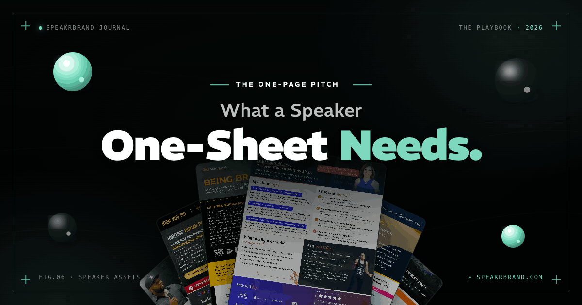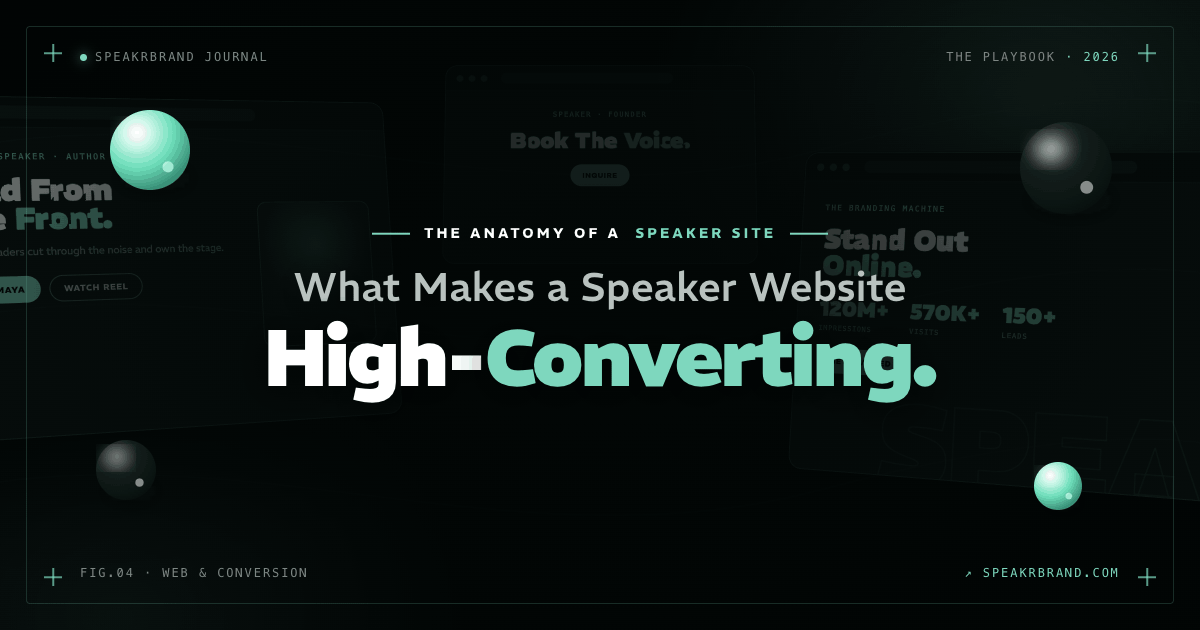
A high-converting speaker website does one thing well: it helps an event organizer decide, fast, why they should book you. Every section either moves that decision forward or gets in the way. The speakers who win inbound inquiries are not the ones with the most pages. They are the ones whose site answers the booking question before a planner has time to second-guess it.
Most speaker websites try to do too much. They cram in the full life story, every talk ever given, and every idea the speaker has had since 2014. The result reads as a biography, not a booking tool. A meeting planner who lands on that page does not feel informed. They feel buried. And buried planners click away.

TLDR
- A speaker website has one job: help a buyer decide why to book you. Everything else is noise.
- Visitors judge your site in about 50 milliseconds and leave most pages within 10 to 20 seconds, so clarity has to hit immediately.
- The first screen should answer three things: what you speak on, who it is for, and why it matters.
- Proof closes the gap. A sizzle reel, real testimonials, and recognizable logos do more than another paragraph of copy.
- Make the next step obvious and easy. Friction and slow load times quietly kill inquiries.
What Is the One Job of a Speaker Website?
The one job of a speaker website is to help a buyer decide, quickly and confidently, why they should book you. It is a decision tool, not a portfolio. When a planner arrives, they are running a private checklist: does this person fit my audience, can they deliver, and can I trust them on my stage?
Here is a filter worth running on every element of your site. If something does not help someone make that decision, you probably do not need it. The bio paragraph about your childhood, the third headshot, the blog post from two years ago that nobody reads. Cut what does not earn its place. Clarity speeds everything up, and speed is what gets people to act before they talk themselves out of it.
If something on your site does not help a planner decide to book you, it is not neutral. It is friction. And friction is the most expensive thing on a speaker website.
Why Does Clarity Convert Better Than Completeness?
Clarity converts better than completeness because buyers decide with their gut long before they read your details. Research from the Stanford Web Credibility Project found that nearly half of consumers, 46.1 percent, judged a website's credibility partly on the appeal of its visual design rather than its content. People form an opinion in roughly a twentieth of a second, and an estimated 94 percent of first impressions are tied to design and layout.
Attention is just as unforgiving. The Nielsen Norman Group reports that users often leave a page within 10 to 20 seconds, and you have about ten seconds to communicate your value proposition or lose them. Add to that the eye-tracking work showing visitors spend only a couple of seconds scanning before they fixate on the area that shapes their whole impression. You do not get a slow build. You get a glance.
This is where most speakers misread the moment. They believe more information builds more confidence. The data says the opposite. In a Harvard Business Review study of thousands of consumers, the single biggest driver of customer loyalty was decision simplicity, the ease with which someone can gather information and weigh their options. Overload does not reassure a buyer. It exhausts them.
What Should Be Visible the Moment Someone Lands on Your Site?
The moment someone lands, three things should be unmistakable: what you speak on, who it is for, and why it matters. If a planner cannot answer those in the first screen, you have already lost the advantage. They should not have to scroll, hunt, or interpret.
This matters because attention concentrates at the top. Nielsen Norman Group's usability research has long shown that people spend the bulk of their time on the first screen and skim the rest. So lead with a sharp positioning line, not a clever tagline that needs decoding. State the topic. Name the audience. Make the stakes obvious. A planner booking a leadership summit wants to know in one beat that you speak on leadership, for executive audiences, because their team is facing exactly the problem you solve.
You have roughly ten seconds to make a planner certain they are in the right place. Spend those seconds on clarity, not personality. Personality keeps them once clarity has earned the time.

How Much Proof Does a Speaker Website Actually Need?
A speaker website needs exactly enough proof to remove doubt, and it should appear right after the positioning, not buried three pages deep. The strongest proof is a short sizzle reel, a handful of specific testimonials, and logos of organizations that have already trusted you. Proof does the work that adjectives cannot.
The reason proof carries so much weight is that buyers trust evidence over claims. Edelman and LinkedIn's B2B research found that 75 percent of decision-makers said a piece of thought leadership led them to research a product or service they had not previously considered. The same body of work shows that 55 percent of decision-makers rate a strong, data-backed point of view as a top characteristic of high-quality thought leadership. For a speaker, that translates directly. A clip of you commanding a room is a point of view they can see. A vague line about being "dynamic and engaging" is one they have to take on faith.
Keep the proof tight. Three credible testimonials beat fifteen generic ones. A thirty-second reel beats a six-minute highlight tape nobody finishes. Recognizable logos beat a long roster of unknown brands. The goal is not to overwhelm a planner with credentials. It is to make booking you feel like the safe, obvious call.
What Stops a Booking Inquiry From Happening?
Two things stop booking inquiries: friction in the path to contact, and a site slow enough to lose people before they ever reach it. Once a planner is convinced, the next step has to be effortless. A buried contact form, a vague "learn more" button, or a page that takes too long to load can undo everything the rest of the site earned.
Speed is not a vanity metric. In the Deloitte and Google study "Milliseconds Make Millions," a mere 0.1-second improvement in mobile load time lifted retail conversion rates by 8.4 percent. For lead generation specifically, the same study found that a 0.1-second speed gain increased form completions by 21.6 percent. A speaker site is a lead-generation engine. Every fraction of a second of delay between interest and inquiry is revenue leaking out.
So make the next step stupid easy. One clear call to action repeated where decisions happen. A short inquiry form, not a twelve-field interrogation. A direct line to check availability. The booking should feel like the natural conclusion of the page, not a scavenger hunt the planner has to win.
Frequently Asked Questions
How many pages should a speaker website have?
Fewer than most speakers think. A focused site can work with a strong homepage, a speaking or topics page, a proof or media section, and a contact path. Add pages only when they help a planner decide, because every extra page is another place for attention to leak.
What belongs above the fold on a speaker website?
Your positioning belongs above the fold: what you speak on, who it is for, and why it matters. Pair that with one clear call to action and a glimpse of proof, such as a reel thumbnail or a recognizable logo. Visitors decide whether to stay based almost entirely on this first screen.
Do I need a speaker reel to get booked?
A reel is the highest-leverage proof asset you can have, because it lets a planner see your stage presence instead of imagining it. Even a tight thirty to sixty second clip outperforms paragraphs of description. If you do not have one yet, prioritize capturing footage at your next event.
How important is website speed for speakers?
Speed directly affects how many inquiries you receive. Research shows that a tenth-of-a-second improvement in load time can raise lead form completions by double digits. A slow site loses interested planners before they ever reach your contact form.
Should my website tell my full story?
No. Your website should tell the part of your story that helps someone decide to book you. Save the full narrative for the stage, where it belongs. On the site, every word competes with a planner's limited attention, so lead with relevance and trim the rest.
The Bottom Line
A speaker website is not a museum of your career. It is a decision engine. Strip it down to the elements that help a planner say yes: clear positioning, fast proof, and an effortless next step. Clarity speeds everything up, and in a market where a booking decision starts in milliseconds, speed is the difference between an inquiry and a closed tab.
If you want to see this applied to your own site, line by line, join the SpeakrBrand webinar Speaker Websites That Convert. We break down exactly what turns a speaker site into inbound, and what to cut today.
A high-converting speaker website does one thing well: it helps an event organizer decide, fast, why they should book you. Every section either moves that decision forward or gets in the way. The speakers who win inbound inquiries are not the ones with the most pages. They are the ones whose site answers the booking question before a planner has time to second-guess it.
Most speaker websites try to do too much. They cram in the full life story, every talk ever given, and every idea the speaker has had since 2014. The result reads as a biography, not a booking tool. A meeting planner who lands on that page does not feel informed. They feel buried. And buried planners click away.
TLDR
- A speaker website has one job: help a buyer decide why to book you. Everything else is noise.
- Visitors judge your site in about 50 milliseconds and leave most pages within 10 to 20 seconds, so clarity has to hit immediately.
- The first screen should answer three things: what you speak on, who it is for, and why it matters.
- Proof closes the gap. A sizzle reel, real testimonials, and recognizable logos do more than another paragraph of copy.
- Make the next step obvious and easy. Friction and slow load times quietly kill inquiries.
What Is the One Job of a Speaker Website?
The one job of a speaker website is to help a buyer decide, quickly and confidently, why they should book you. It is a decision tool, not a portfolio. When a planner arrives, they are running a private checklist: does this person fit my audience, can they deliver, and can I trust them on my stage?
Here is a filter worth running on every element of your site. If something does not help someone make that decision, you probably do not need it. The bio paragraph about your childhood, the third headshot, the blog post from two years ago that nobody reads. Cut what does not earn its place. Clarity speeds everything up, and speed is what gets people to act before they talk themselves out of it.
If something on your site does not help a planner decide to book you, it is not neutral. It is friction. And friction is the most expensive thing on a speaker website.
Why Does Clarity Convert Better Than Completeness?
Clarity converts better than completeness because buyers decide with their gut long before they read your details. Research from the Stanford Web Credibility Project found that nearly half of consumers, 46.1 percent, judged a website's credibility partly on the appeal of its visual design rather than its content. People form an opinion in roughly a twentieth of a second, and an estimated 94 percent of first impressions are tied to design and layout.
Attention is just as unforgiving. The Nielsen Norman Group reports that users often leave a page within 10 to 20 seconds, and you have about ten seconds to communicate your value proposition or lose them. Add to that the eye-tracking work showing visitors spend only a couple of seconds scanning before they fixate on the area that shapes their whole impression. You do not get a slow build. You get a glance.
This is where most speakers misread the moment. They believe more information builds more confidence. The data says the opposite. In a Harvard Business Review study of thousands of consumers, the single biggest driver of customer loyalty was decision simplicity, the ease with which someone can gather information and weigh their options. Overload does not reassure a buyer. It exhausts them.
What Should Be Visible the Moment Someone Lands on Your Site?
The moment someone lands, three things should be unmistakable: what you speak on, who it is for, and why it matters. If a planner cannot answer those in the first screen, you have already lost the advantage. They should not have to scroll, hunt, or interpret.
This matters because attention concentrates at the top. Nielsen Norman Group's usability research has long shown that people spend the bulk of their time on the first screen and skim the rest. So lead with a sharp positioning line, not a clever tagline that needs decoding. State the topic. Name the audience. Make the stakes obvious. A planner booking a leadership summit wants to know in one beat that you speak on leadership, for executive audiences, because their team is facing exactly the problem you solve.
You have roughly ten seconds to make a planner certain they are in the right place. Spend those seconds on clarity, not personality. Personality keeps them once clarity has earned the time.
How Much Proof Does a Speaker Website Actually Need?
A speaker website needs exactly enough proof to remove doubt, and it should appear right after the positioning, not buried three pages deep. The strongest proof is a short sizzle reel, a handful of specific testimonials, and logos of organizations that have already trusted you. Proof does the work that adjectives cannot.
The reason proof carries so much weight is that buyers trust evidence over claims. Edelman and LinkedIn's B2B research found that 75 percent of decision-makers said a piece of thought leadership led them to research a product or service they had not previously considered. The same body of work shows that 55 percent of decision-makers rate a strong, data-backed point of view as a top characteristic of high-quality thought leadership. For a speaker, that translates directly. A clip of you commanding a room is a point of view they can see. A vague line about being "dynamic and engaging" is one they have to take on faith.
Keep the proof tight. Three credible testimonials beat fifteen generic ones. A thirty-second reel beats a six-minute highlight tape nobody finishes. Recognizable logos beat a long roster of unknown brands. The goal is not to overwhelm a planner with credentials. It is to make booking you feel like the safe, obvious call.
What Stops a Booking Inquiry From Happening?
Two things stop booking inquiries: friction in the path to contact, and a site slow enough to lose people before they ever reach it. Once a planner is convinced, the next step has to be effortless. A buried contact form, a vague "learn more" button, or a page that takes too long to load can undo everything the rest of the site earned.
Speed is not a vanity metric. In the Deloitte and Google study "Milliseconds Make Millions," a mere 0.1-second improvement in mobile load time lifted retail conversion rates by 8.4 percent. For lead generation specifically, the same study found that a 0.1-second speed gain increased form completions by 21.6 percent. A speaker site is a lead-generation engine. Every fraction of a second of delay between interest and inquiry is revenue leaking out.
So make the next step stupid easy. One clear call to action repeated where decisions happen. A short inquiry form, not a twelve-field interrogation. A direct line to check availability. The booking should feel like the natural conclusion of the page, not a scavenger hunt the planner has to win.
Frequently Asked Questions
How many pages should a speaker website have?
Fewer than most speakers think. A focused site can work with a strong homepage, a speaking or topics page, a proof or media section, and a contact path. Add pages only when they help a planner decide, because every extra page is another place for attention to leak.
What belongs above the fold on a speaker website?
Your positioning belongs above the fold: what you speak on, who it is for, and why it matters. Pair that with one clear call to action and a glimpse of proof, such as a reel thumbnail or a recognizable logo. Visitors decide whether to stay based almost entirely on this first screen.
Do I need a speaker reel to get booked?
A reel is the highest-leverage proof asset you can have, because it lets a planner see your stage presence instead of imagining it. Even a tight thirty to sixty second clip outperforms paragraphs of description. If you do not have one yet, prioritize capturing footage at your next event.
How important is website speed for speakers?
Speed directly affects how many inquiries you receive. Research shows that a tenth-of-a-second improvement in load time can raise lead form completions by double digits. A slow site loses interested planners before they ever reach your contact form.
Should my website tell my full story?
No. Your website should tell the part of your story that helps someone decide to book you. Save the full narrative for the stage, where it belongs. On the site, every word competes with a planner's limited attention, so lead with relevance and trim the rest.
The Bottom Line
A speaker website is not a museum of your career. It is a decision engine. Strip it down to the elements that help a planner say yes: clear positioning, fast proof, and an effortless next step. Clarity speeds everything up, and in a market where a booking decision starts in milliseconds, speed is the difference between an inquiry and a closed tab.
If you want to see this applied to your own site, line by line, join the SpeakrBrand webinar Speaker Websites That Convert. We break down exactly what turns a speaker site into inbound, and what to cut today.

.png)